The following post is inspired by one I read on YA author Jill Murray's blog last year about gender and reading. In it she did some very cool unisex cover designs for her books Break On Through and Rhythm and Blues. I've been meaning, ever since I read her post, to create my own more unisex covers.
Personally, I bristle at the idea that people are drawn to certain design types based on their gender but advertisers and marketers make a living out of trying to hem people in and shrink them down to size. They attempt to define us with their visions of masculinity and femininity because if they can convince us who we are, they can also convince us what we need to buy in order to be that guy or girl.
There's a common belief in YA publishing (pretty much the same one we see at play in Hollywood movie making) that guys don't want to read about girls. It's insulting, to say the least and who's to say how true it really is or how true it would be if entertainment wasn't so often designed and packaged with that sexist belief in mind? The ideas constantly put across by advertisers and mass media are that guys like fast cars, team sports, tech gadgets, shoot-em up action in their entertainment, hate shopping (except for fast cars, tech gadgets and shoot-em up entertainment), love beer, are sex obsessed but mostly uninterested in intimacy and are emotionally one-dimensional. Girls, on the other hand are portrayed as innately nurturing and communicative, ruled by their emotions, obsessed with romantic love, shopping, fashion, 'pretty' things in general and anything related to the home and cooking.
And so L'Oreal Vive for Men and Axe put their products in a black bottle they think exudes a masculine look while chocolate bar Yorkie even goes so far as to proclaim on the package 'It's not for girls'. Meanwhile practically anything marketed to woman and girls (we're talking telescopes to frying pans to the game of Monopoly) is released in a pink edition as though anyone with ovaries has a deep and natural affinity for the colour. Pink's become a sort of marketing shorthand — girls, this is for you.
The publishing industry, having figured out teenage boys don't read much (though again, who knows why? Is it because it's ingrained in them by society that this activity isn't for them? How can we ever say what they or anyone would naturally be drawn to when we're bombarded by gender pressure messages from the moment we're born?) chiefly focuses their marketing efforts on girls. Publishers (with added pressure from chain Booksellers) don't rely on pink to gender code their products the way many other industries do but they definitely do gender code YA covers and more often than not those covers are designed to appeal to girls (more on that here) in a monolithic way.
No doubt this coding does sell a certain numbers of books but the problem is that in aiming for a certain kind of reader, a cover can alienate others. Like guys and girls who feel that coding has marked that book as being not for them, albeit in a subtler way than the Yorkie bar!
I like to think of my books as potentially appealing to readers of any gender yet I've read, not infrequently, reviews or Internet commenters mention that while they believe boys would enjoy I Know It's Over or My Beating Teenage Heart, for example, they probably wouldn't pick them up in the first place because of their covers. In the case of I Know It's Over a writer friend passed on direct comments from a sixteen-year-old boy she knew who, after reading the book, said it was awesome and that he had several friends who should read it but that he knew they'd be worried about being seen with the cover.
Firstly, I hate the fact that teenage boys feel their gender is so strictly policed, by each other as well as by much of the rest of society, (if you want to know more about that read Dude, You're a Fag: Masculinity and Sexuality in High School) that it stops them from picking up certain books. Hate it.I hate gender policing in general because it limits all of us.
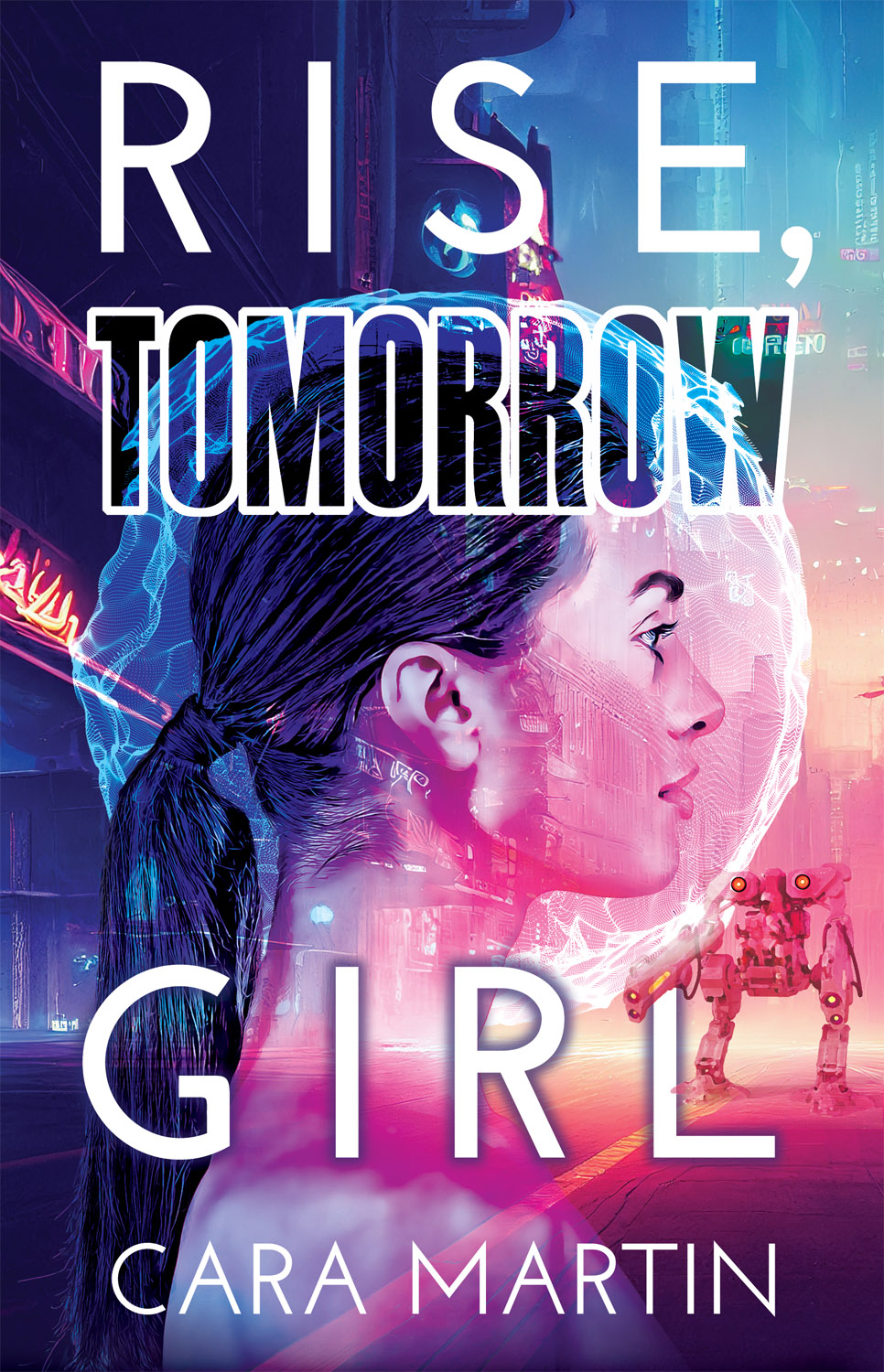
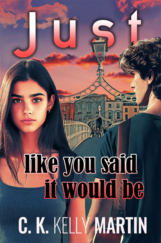
Secondly, although I'm fond of my book covers I can also see that while they may attract some readers, likewise they'll discourage others. So I've run with Jill Murray's idea (before I was published I used to regularly design mock covers for my stuff) and have re-imagined the covers of all my books to appeal to a different audience, chiefly, a more unisex one but also perhaps more literary in nature (maybe I'm having delusions of grandeur?). You'll notice I've avoided faces (faces on covers are a pet peeve of mine) and people in general and have instead concentrated on mood. Have a look and see what you think. Do these alternate covers make the books feel like different entities than the current covers suggest? Do they make you more interested in the books or less?
Personally, I bristle at the idea that people are drawn to certain design types based on their gender but advertisers and marketers make a living out of trying to hem people in and shrink them down to size. They attempt to define us with their visions of masculinity and femininity because if they can convince us who we are, they can also convince us what we need to buy in order to be that guy or girl.
There's a common belief in YA publishing (pretty much the same one we see at play in Hollywood movie making) that guys don't want to read about girls. It's insulting, to say the least and who's to say how true it really is or how true it would be if entertainment wasn't so often designed and packaged with that sexist belief in mind? The ideas constantly put across by advertisers and mass media are that guys like fast cars, team sports, tech gadgets, shoot-em up action in their entertainment, hate shopping (except for fast cars, tech gadgets and shoot-em up entertainment), love beer, are sex obsessed but mostly uninterested in intimacy and are emotionally one-dimensional. Girls, on the other hand are portrayed as innately nurturing and communicative, ruled by their emotions, obsessed with romantic love, shopping, fashion, 'pretty' things in general and anything related to the home and cooking.
And so L'Oreal Vive for Men and Axe put their products in a black bottle they think exudes a masculine look while chocolate bar Yorkie even goes so far as to proclaim on the package 'It's not for girls'. Meanwhile practically anything marketed to woman and girls (we're talking telescopes to frying pans to the game of Monopoly) is released in a pink edition as though anyone with ovaries has a deep and natural affinity for the colour. Pink's become a sort of marketing shorthand — girls, this is for you.
The publishing industry, having figured out teenage boys don't read much (though again, who knows why? Is it because it's ingrained in them by society that this activity isn't for them? How can we ever say what they or anyone would naturally be drawn to when we're bombarded by gender pressure messages from the moment we're born?) chiefly focuses their marketing efforts on girls. Publishers (with added pressure from chain Booksellers) don't rely on pink to gender code their products the way many other industries do but they definitely do gender code YA covers and more often than not those covers are designed to appeal to girls (more on that here) in a monolithic way.
No doubt this coding does sell a certain numbers of books but the problem is that in aiming for a certain kind of reader, a cover can alienate others. Like guys and girls who feel that coding has marked that book as being not for them, albeit in a subtler way than the Yorkie bar!
I like to think of my books as potentially appealing to readers of any gender yet I've read, not infrequently, reviews or Internet commenters mention that while they believe boys would enjoy I Know It's Over or My Beating Teenage Heart, for example, they probably wouldn't pick them up in the first place because of their covers. In the case of I Know It's Over a writer friend passed on direct comments from a sixteen-year-old boy she knew who, after reading the book, said it was awesome and that he had several friends who should read it but that he knew they'd be worried about being seen with the cover.
Firstly, I hate the fact that teenage boys feel their gender is so strictly policed, by each other as well as by much of the rest of society, (if you want to know more about that read Dude, You're a Fag: Masculinity and Sexuality in High School) that it stops them from picking up certain books. Hate it.I hate gender policing in general because it limits all of us.
Secondly, although I'm fond of my book covers I can also see that while they may attract some readers, likewise they'll discourage others. So I've run with Jill Murray's idea (before I was published I used to regularly design mock covers for my stuff) and have re-imagined the covers of all my books to appeal to a different audience, chiefly, a more unisex one but also perhaps more literary in nature (maybe I'm having delusions of grandeur?). You'll notice I've avoided faces (faces on covers are a pet peeve of mine) and people in general and have instead concentrated on mood. Have a look and see what you think. Do these alternate covers make the books feel like different entities than the current covers suggest? Do they make you more interested in the books or less?